If you’re a provider of tours and activities, there’s a high chance that you’re incredibly busy at the moment. We’re in the middle of summer, and travel is back with a bang! During the recent Activate Berlin event, GetYourGuide CEO Johannes Reck stated that the famous OTA has doubled its pre-Covid numbers in all the major countries where they operate.
Marketplaces and travel agencies are not the only ones benefiting from the recovery. In a survey organized by Arival and Tiqets, involving 250 operators worldwide, 67% of the respondents declared they were at, or above, 2019 levels.
On the flip side, the biggest concern of OTAs and providers is keeping up with the ever-rising demand. Some could argue that this is a nice problem to have after the last couple of years, but it’s still a problem. Currently, multiple players in our sector are struggling to hire and retain employees. According to Le Monde, in Emilia Romagna (Italy), 83% of businesses cannot find enough staff. Similarly, over 50,000 seasonal workers are missing on the Spanish coastline.
Here at Regiondo, we’ve been asking ourselves what we can do to help our partners during such a hectic period. As you probably already know, we strive to build the most loved booking solution in the world. For us, providing a fantastic piece of software is not nearly enough. Our goal is to be there for our clients and to support them when they face difficult challenges.
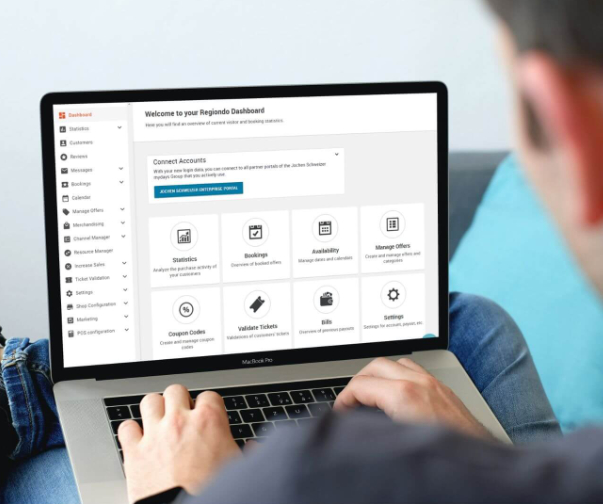
For this purpose, we’ve completely revamped the navigation of our web app. The new interface will empower you to work faster and more efficiently. At the same time, it will improve the user experience on phones and tablets. The result is that you’ll be able to comfortably manage your reservations on the go, even when you’re busy with other tasks.
Last but not least, the new design is brighter, cleaner, and more beautiful than ever. Who said that form and function couldn’t go hand in hand? Anyway, let’s take a look at the most significant changes, and how these new features will improve your day-to-day operations.
- Now the navigation bar is fixed at the top of the screen. This means that, even while scrolling, the navigation menu will remain visible in the upper part of the page. This way, you can always access the main functionalities of Regiondo in less than a second.
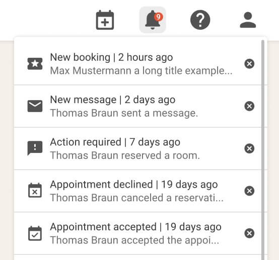
- Check all your booking notifications by clicking on the bell icon.
- There are five types of notifications related to your bookings. You can see examples of each in the screenshot below.
 Swiftly add a new booking by clicking on the plus icon (the first one from the left).
- To avoid confusion, we have removed product update notifications. To keep up with announcements of new features, please subscribe to our newsletter.
- Click on the question mark icon to open our Knowledge Base.
- We have moved the option to change the language of your dashboard under the “Profile” drop-down menu. You can access it by clicking on the icon located at the right end of the bar.
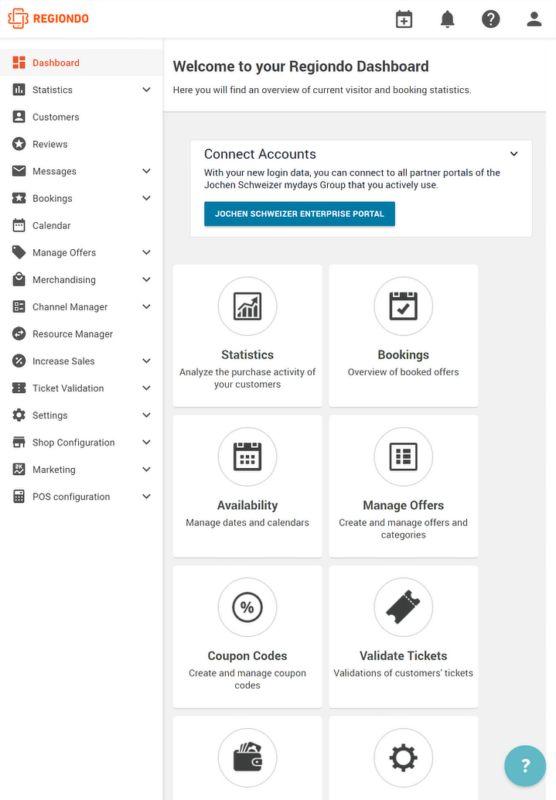
- Now you can scroll through the side menu independently from the body of the page and vice versa. This new feature allows you to keep an eye on the information you’re reading while looking for the next tool you need.
- Previously, if you wanted to access the submenu for one of Regiondo’s tools (e.g., the Channel Manager) you had to click on it and wait for a new page to load. Only then could you see – and select – the items inside it. Now you just need to click on the down-arrow icon to open the corresponding drop-down menu. From there, you can select the feature you need to use. As you can imagine, this is a far smoother workflow that saves you a lot of time in the long run.
- As you have probably noticed, each item on the menu now has an icon on its left side. You can spot faster the functionality you need to use, especially on mobile and tablets.
- For clarity, opened menu items are highlighted in grey and orange.
- There are no significant changes in the footer, except for the new graphic design.
- The above tweaks and improvements dramatically benefit our web app’s mobile interface. You can expand the navigation menu on your smartphone by clicking on the burger icon on the left. Check out the video below to see it in action.
- On tablets, the navigation is almost identical to the desktop version. The main difference is that you can collapse the sidebar by clicking on the burger icon next to the Regiondo logo.

Release Date
The new and improved navigation menu will be available during the next few weeks for all our customers! We’re confident that its cleaner design and faster performance will significantly improve your user experience. Furthermore, the improvements to the mobile interface will make using Regiondo on the go much easier. This way, you’ll be able to check your bookings and do some administrative work even when you’re busy with your tours.
Keep in mind that this is only the first enhancement of many. During the following months, Regiondo will change for the better: our software is getting faster, sleeker, and more feature-rich than ever. It will be an exciting journey, and we want you to be an integral part of it.
As mentioned before, to stay updated with our product-related announcements, subscribe to our newsletter and keep checking out our blog. Don’t miss out on new exciting features!
If you have any questions regarding Regiondo, contact our Customer Support team or consult the Knowledge Base.


